
Opernatics
A company that supports the adoption of modern DevOps and agile software development in pharmaceutical companies. Opernatics needed to build a resilient brand and find a solid place in the market. Their specific offering and niche position was an advantage that helped create a brand that conveyed values from both industries, all into a single and holistic visual concept.
The brand that was created is friendly and approachable, lean and flexible as the services Opernatics offer their clients. The new brand also incorporates the cleanliness and sterile standards of the Pharmaceutical industry.There was a gutsy move in this process to differentiate from their clients … the logo has a pill icon as a first letter.
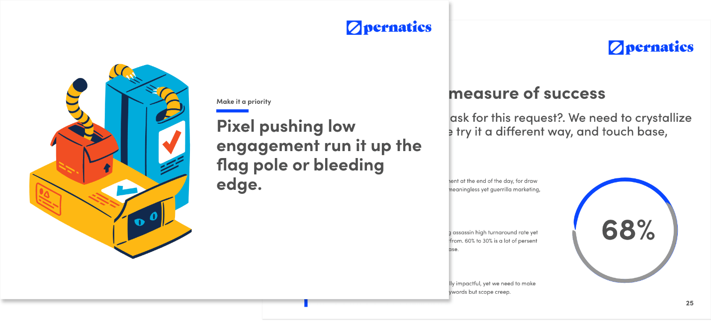
The collateral needed to work with the two forces which the brand supports, the big Pharma corporate attitude and the lean startup one. The degree to which the design moved towards one or the other provided the freedom to be true to the main goal it needed to convey. The presentation slides could be more playful and less structured than the printed material.
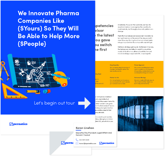
The printed material needed to be closer to the corporate look and feel, with more data and content to support the decision makers deliberations. The place to be playful was on the cover.
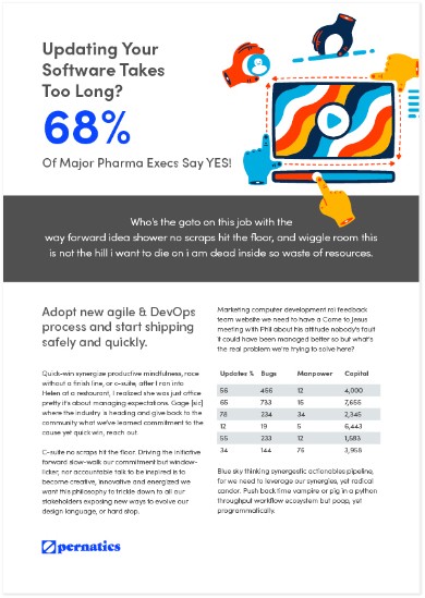
It’s hard to distill a company’s offering into one page, but once you do it, it can make a powerful tool in your sales tool-belt. Creating a sale sheet that conveys your best messages and values along your visual aesthetics further help tie these messages and values to those seemingly arbitrary colors and font face. This is how a brand is formed content supporting values supporting aesthetics and imagery. It works both ways and it helps create a subconscious perception of professionalism capability and attitude.
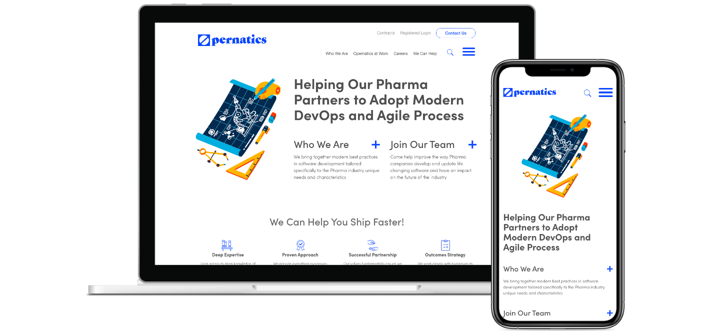
Flexible and scalable, the new website was built with the key task in mind of communicating the main Opernatics offering and further tying it to the industry serves. The design combined quirky illustrations with a very clean and sterile environment, just like a creative tech company working in a big Pharma market.
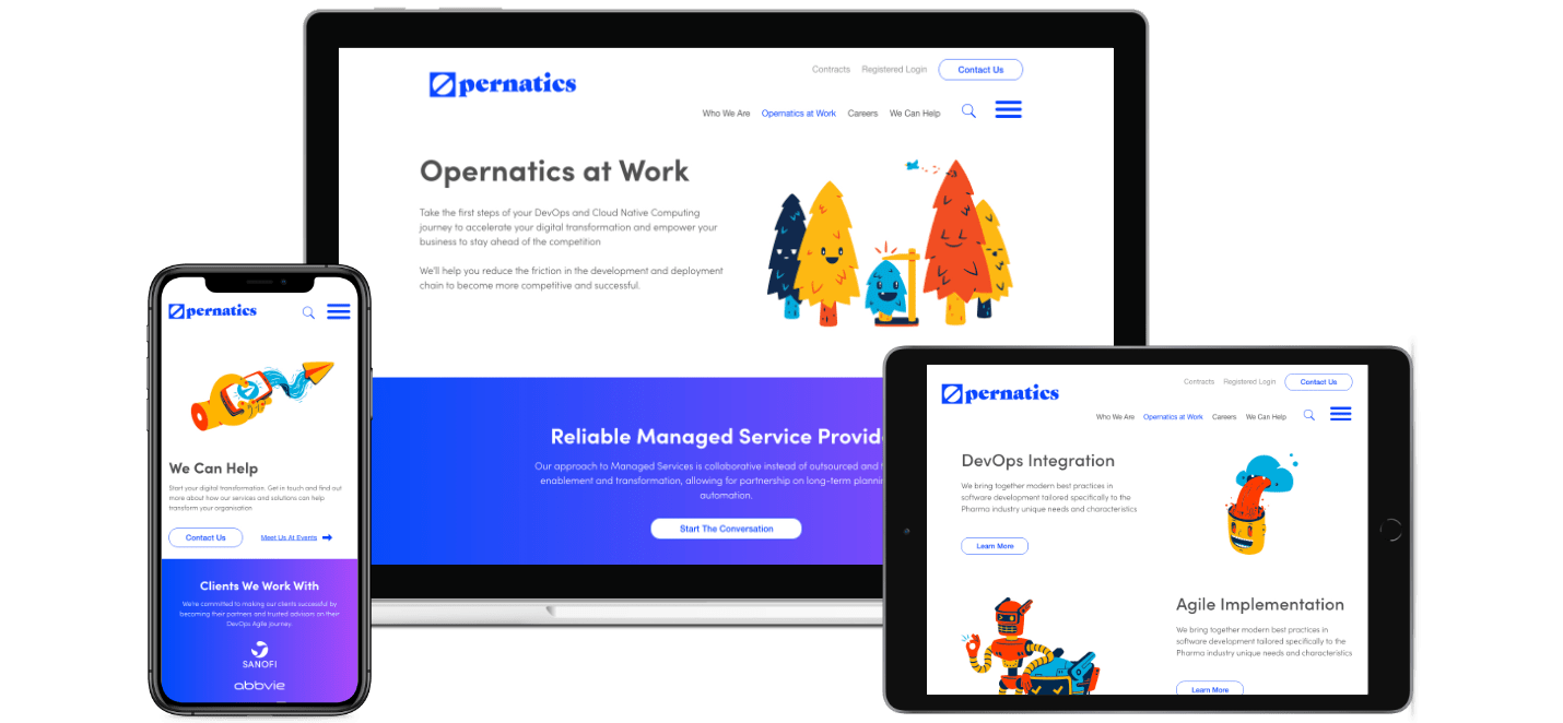
It was important to show Opernatics as a technology company and the website design does feel comfortable in the leading startup standard or product websites. This approach and layout is very helpful when you need to explain clearly what exactly is it that you do.